Pink Sweat$ Conceptual Rebrand
The Purpose
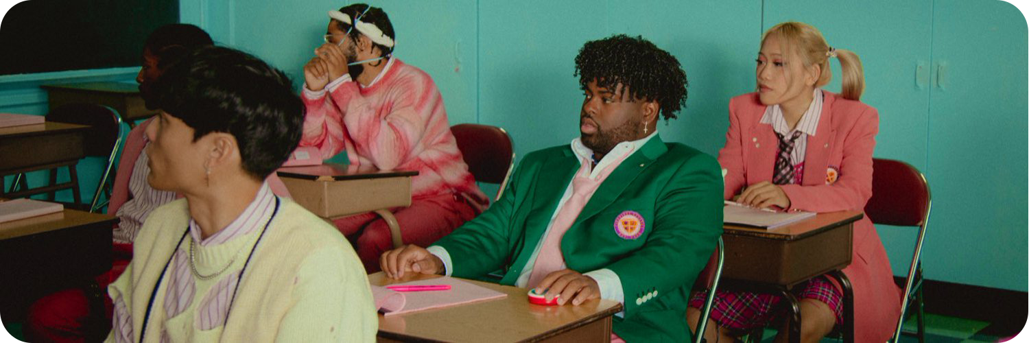
Pink Sweat$ blew up within the first year he debuted. Over the years, his art style changed for every single, EP, and album he released. However, the general concept stayed the same, giving a soft look as an RNB artist. His artworks tend to include flowers, clouds, teddy bears, and soft glow. To commemorate his success so far, this new look goes in a different direction where we include his iconic elements in a digital scrapbook and cut-paper style meshed with my photography.
The Current Brand
The Moodboard
The New Direction
When it came to Heaven, Pink Planet, and Pink Moon, Pink Sweat$ was thinking about love, inclusivity, and creative freedom. Reality can be whatever he wants with this style. The scrapbook look makes it easy to keep a consistent theme without feeling like that will restrict new art ideas. The new color palette is actually very similar to his current one. I adjusted it to give a more energetic vibe rather than the more relaxed contrast of dark cyan, soft pink, and red-tint coral. The new color palette includes green-tint dark cyan, light pink, and light yellow. This color combination is very unique because we have cool and warm tones and instead of clashing, it compliments each other well. The font I selected for the new look is Straczynski Italic. It gives a bold statement look, which goes well with the new color palette. This new art direction really shows that he is piecing his art together to speak about love, inclusivity and creative freedom, layer by layer.


